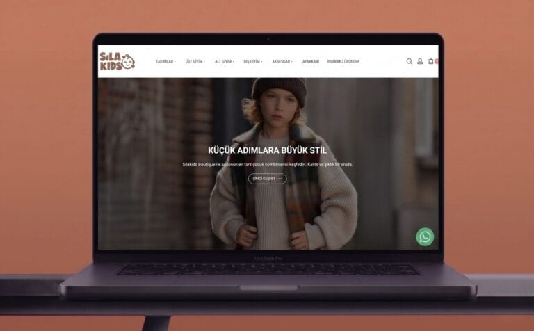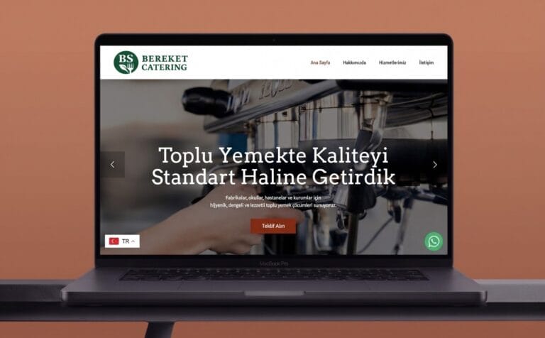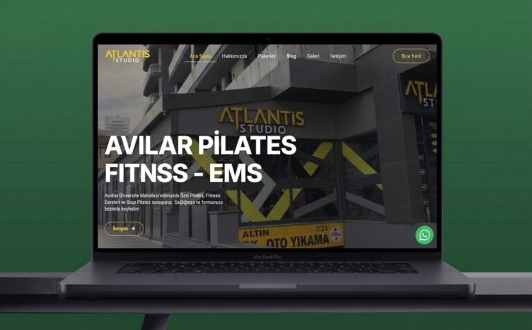



Take the first step towards custom web design and digital solutions for your brand. Start now →

1618 Content is a new generation digital agency that gathers "under one roof" all the creative and strategic services - creative content production, corporate identity and performance-oriented advertising management - necessary for modern brands to have a strong presence in the digital world. Within the scope of this portfolio project, we designed a minimalist, clear and modern web platform that would reflect this multifaceted service structure and user-oriented approach of the agency in the digital environment. The main purpose of the design was to make the brand's power and clear services felt in every pixel by avoiding clutter. By using symbolic elements such as theatrical masks, we emphasized the emotional diversity and mastery in content production.
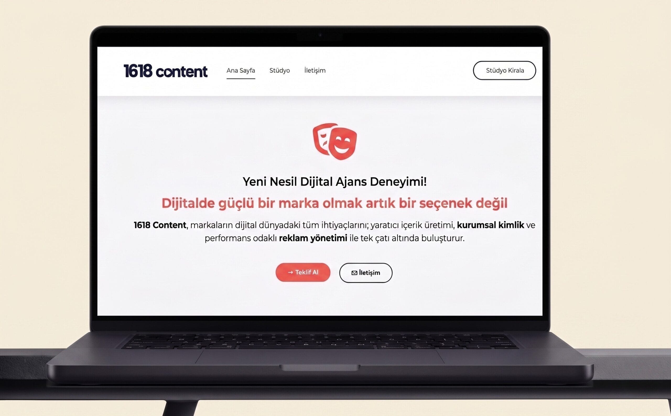
Although 1618 Content's services were comprehensive and effective, the brand's digital storefront was failing to accurately communicate the unity of services and modern agency experience under this "one roof". As the needs of brands in the digital world increased, the comprehensibility of 1618's services and conversion rates became a problem. Brands, the target audience, were getting lost between different agencies for critical needs such as corporate identity or advertising management, and were unable to discover the unifying solution offered by 1618.
We created a modern, minimalist and content-oriented website that is in line with the brand's vision, focusing on the nobility of dark tones and the power of clear headings. By optimizing the user experience (UX), we placed powerful call buttons such as "Rent a Studio" and "Get a Quote" at strategic points. We built a fluid interface that presents services under "one roof" with clear categories. Thanks to this clutter-free design, 1618 Content is now presented to brands in the digital arena on a visually and functionally flawless digital stage, clearly demonstrating its power to solve their every need from a single point.
I'm waiting for your feedback. If you tell me what you think about the design, texts, mockup type or background color, I can help you better.